长沙新航道雅思写作小编分享雅思小作文示范写作动态线图:澳洲不同行业就业比例。每一篇范文都经由专业团队反复校对,最终外教审查定稿。成功就是日复一日那一点点小小努力的积累。
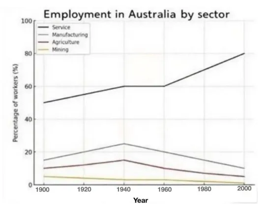
The line graph below shows the employment rate in four different industries in Australia from 1900 to 2000.
主体段分段:
Body 1:Service(始终最高)、Mining(始终最低)
Body 2:Manufacturing、Agriculture(趋势相似)
开头段
The line graph illustrates changes in the percentage of people working in four sectors(service, manufacturing, agriculture, and mining) during the period from 1900 to 2000.
概述段
Overall, the service industry employed the largest proportion of the workforce throughout the given period, and was the only sector that experienced a rising trend in employment.
思路要点:
- Service Industry数值一直最高
- 只有Service Industry数值呈现上升趋势
Body paragraph 1
In 1900, 45% of the surveyed population worked in the service sector. This figure gradually increased to 60% in 1940 and remained unchanged for the next 20 years, before rising noticeably to 80% in 2000. Conversely, mining started at a relatively low level of 5% and saw a gradual decrease to 2% by 1940. After a stable period of two decades, it continued to fall steadily, reaching just 1% by the end of the period.
思路要点:
- Service:1900年为45%→随后逐步上升,到1940年达到60%→随后到1960年保持平稳→到2000年显著上升到80%
- Mining:1900年为5%→随后小幅度下降到1940年的2%→到1960年保持平稳→到2000年持续下降到1%
Body paragraph 2
The remaining two sectors(manufacturing and agriculture) followed similar trends. Initially, 15% of people were employed in the manufacutring sector, 5% higher than that in agriculture. Over the subsequent four decades, these two figures grew significantly to 22% and 15% respectively. However, both sectors experienced a steady decline, with manufacturing falling to 10% and agriculture dropping to just 5% by 2000.
思路要点:
- Manufacutring、Agriculture呈现相似趋势
- Manufacturing在1900年数值为15%,比Agriculture数值高5%→随后显著上升,在1940年分别达到22%和15%→到2000年显著下降到10%和5%
【责任编辑】:长沙新航道小编 版权所有:转载请注明出处
如本网转载稿、资料分享涉及版权等问题,请作者见稿后速与新航道长沙学校联系,我们会第一时间删除.